Straight Line Construction Branding
OUR ROLE
Logo
Brand Styling
Squarespace Website
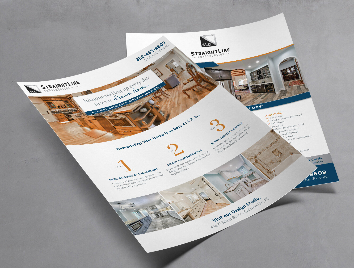
Brochures & Flyers
Marketing Collateral
PROJECT OVERVIEW
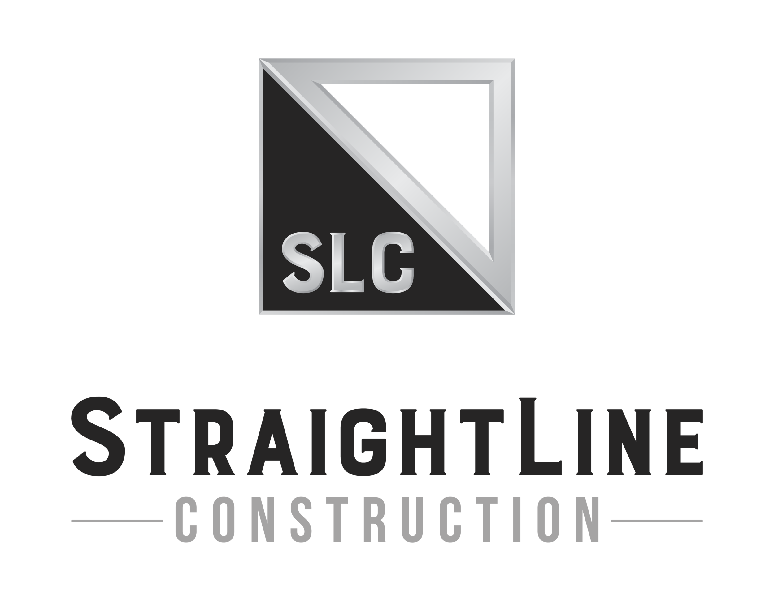
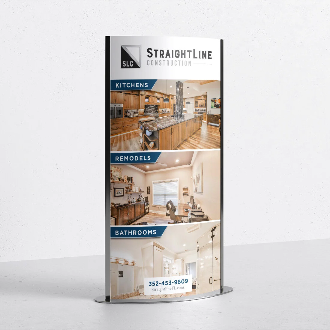
Dan of Straight Line Construction wanted a more polished and professional look for his brand, website and marketing materials in order to uplevel his clientele. He needed his brand to match the quality of work he provides to his clients and customers. Dan wanted an icon that would be catchy and memorable in order to build brand recognition in his local market. Desiring to leave room for expanding his services beyond construction, he didn’t want to use tools or anything overtly construction-related in his logo. Therefore, I chose a silver triangle to represent a triangular straightedge tool.
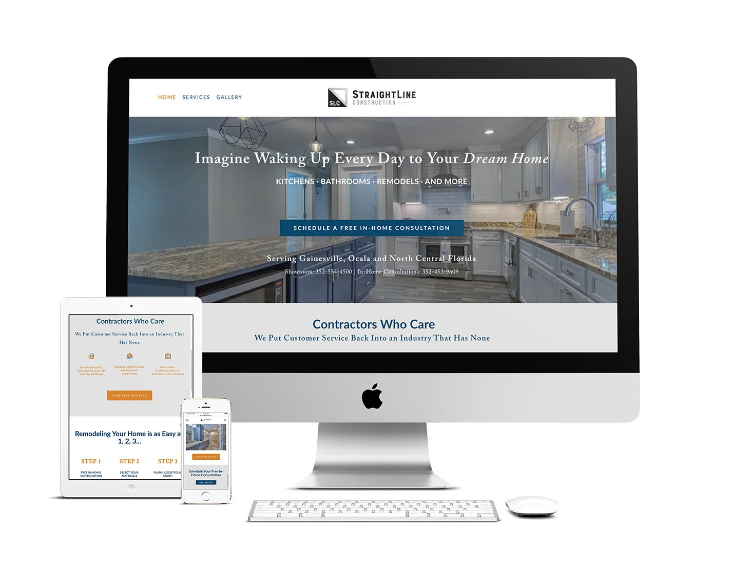
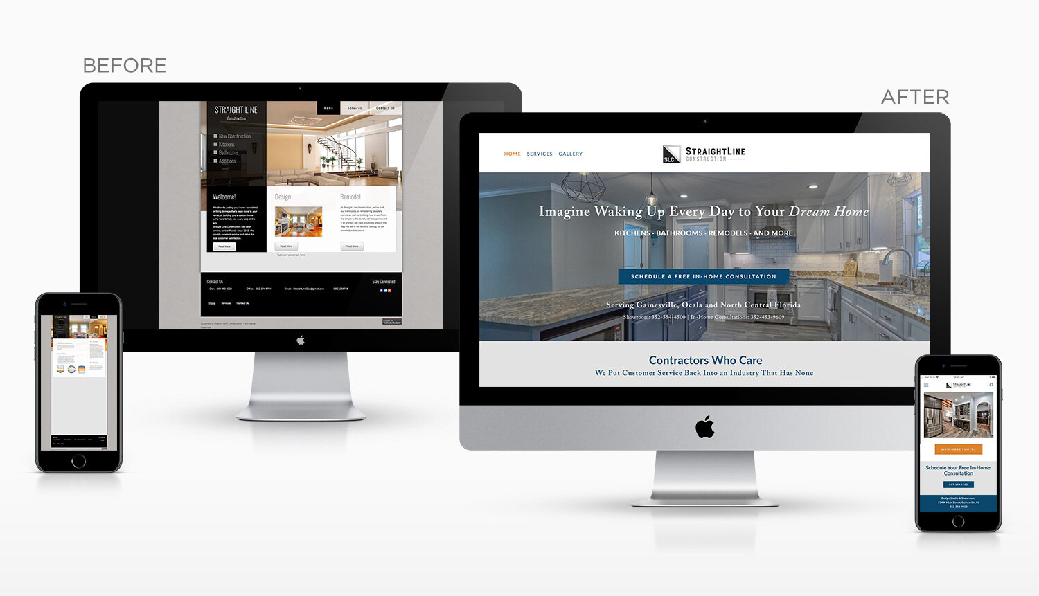
The former Straight Line website was not responsive or mobile friendly, so it didn’t show well on various screen sizes. The new website is fresh, clean and straightforward, pointing people toward scheduling their free in-home consultation, which is how the company lands the majority of their clients.
VIEW MORE
