I only wash my car when I see kids fundraising for their next sports competition or missions trip. It’s cheap, fast, and supports a great cause. At the last car wash, the cute little gymnasts were having way more fun tumbling down the grass than actually washing cars. So the two young girls scrubbing my car missed a lot of dirt – like, a whole side, three tires, and my windshield.
You get what you pay for, amiright?
The same goes for branding. A cheap, quickly designed logo will lack the professionalism, thoughtfulness and perfection of a thoroughly brainstormed, intentionally designed brand.
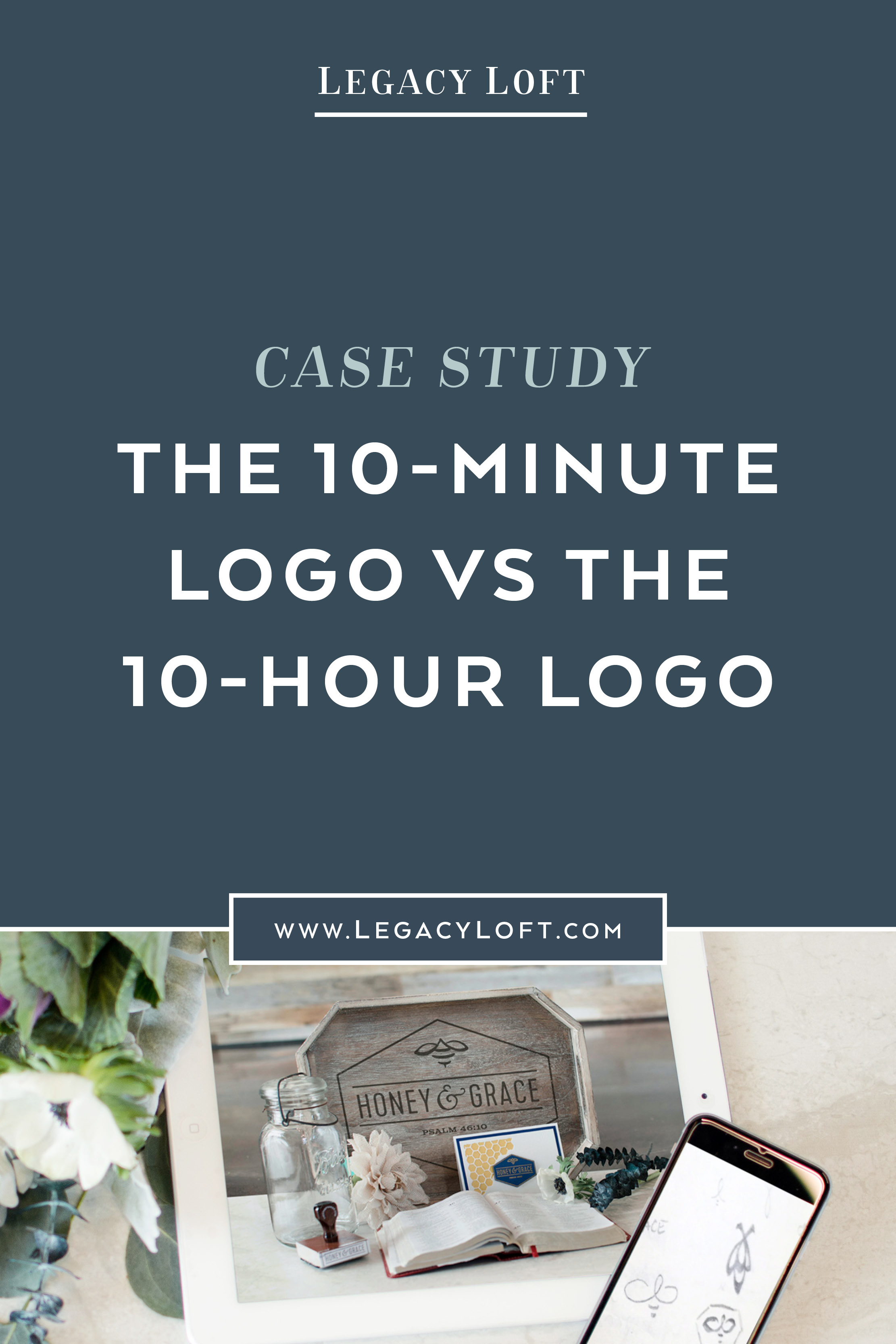
The 10-Minute Logo
What's a 10-minute logo, you ask? Great question! It may not actually take 10-minutes, but it's basically just a logo designed without any strategy behind it, without any research or sketching, without hundreds of tweaks and revisions, without refining the letter spacing and type treatment.
Who the 10-minute logo is good for:
If you're just starting out, the 10-minute logo might be all you need. It's perfect if you're unsure what direction you want to take your business in. Your sweet idea could completely transform over the next year, reaching a different audience than expected and offering products & services you hadn't thought through yet. If that's you, the 10-minute logo will suit you just fine until you're ready for complete brand clarity to take your business to the next level.
Please note, there's a difference between a 10-minute logo from a professional designer and a 10-minute logo from your neighbor's nerdy nephew who happens to own Photoshop. Remember, you get what you pay for!
The 10-Hour Logo
These logos are my favorite, and usually created as a part of a whole brand package. For these, I thoroughly research your market, ideal clients, and competition. I dig into the heart of your business and values to apply color theory and design psychology. I carefully select the fonts and perfectly space out every letter. I create dozens of variations and options, most of which I'll scrap before the drafts even hit your inbox.
Who the 10-hour logo is good for:
The 10-hour logo might be for you if:
You have a solid business idea and know your ideal clients (even if it's a startup)
You've been getting by with a 10-minute logo and are ready for a more custom design
Your business has shifted direction or expanded beyond what your current brand represents
You're ready for the utmost professional brand to take your business to the next level
While the logo itself may take 10 hours to think up, design and perfect, it's usually accommodated by an entire brand suite. Creating print collateral, a website and social media graphics — all built with intention and thoroughly researched — can take weeks to months. But the process is worth the time in order to get a brand packed with meaning and designed with professionalism. This is how you reach your ideal clients and create a brand that will grow with you!
Brand Case Studies
I’d like to share a few case studies of my own work to show the difference between a 10-minute logo and a 10-hour logo.
Honey & Grace
My former personal blog, Honey & Grace, is aimed to help busy-bee Christian women stay grounded in their faith while building their businesses. I wanted the logo to reference Christianity, while also representing something bee-ish. My initial logo used two Christian fish symbols to form a bee. I placed it in a hexagon, and my 10-minute logo was done (ok, maybe a 1-hour logo since I’d been sketching in my notebook awhile beforehand). The mark somewhat resembles the AirBnB logo and just doesn’t look too special.
I knew I could do better, so I kept sketching, tweaking and designing. After a bunch of new versions, I finally created one I loved. I still used the Christian fish symbol for the wings of the bee, but now have a more memorable, custom mark, with stronger typography and a more appealing hexagon shape.
Van Allan Communications
Breaking from my normal female clientele, my brother-in-law came to me a year ago to create a logo for his side-gig. He needed something quick for some letterhead to get him by. I whipped up a logo using “Copperplate” – an extremely overused font, and didn't put much thought & effort into the design. It worked for the time being.
Now that his business is expanding, he realized he needed full branding, not just a logo. I took things back to the drawing board, conducted some market research and started creating a logo that was more custom and targeted. Rather than using a font for the V & A, I drew my own, playing around with a bunch of different versions. I added some dimensions and shading, as well as more sophisticated typography.
P.S. Are there any Virtual Assistants in the house that would like a ready-made "VA" logo? **Hint, hint... it'll be cheap!**
Legacy Loft
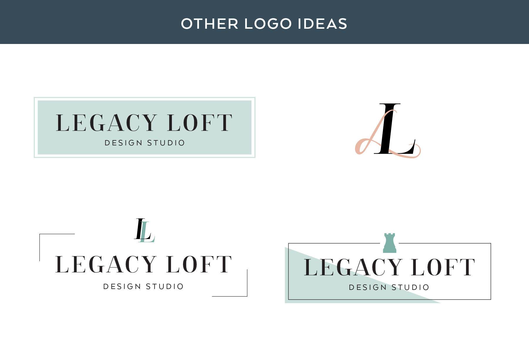
While rebranding my own business, I of course wanted to jump right into the logo design without treating myself like a client and going through the full branding process (#designerprobs). I liked the idea of a chess piece to represent the “strategy” behind my branding & design process (ironic that I didn’t use strategy for the chess logo, right?). Had I stopped there, I think I would’ve really struggled to build out the rest of my brand. I would once again have a logo that was alienated from my other brand elements (read about the why I rebranded in the first place here).
After realizing I needed to apply strategy to my brand process, I went back to square zero. I conducted tons of research to refine my ideal client and figure out what colors & styles they'd be drawn to. I looked at my competition to ensure I was creating something unique, but not off base with my clientele. I dug deep into who I was and what I wanted my brand to represent. It took me months to create my new brand, and in the end, I realized I could even repurpose parts of my old Legacy Loft logo and some of the typography from my initial redesign. While my logo is decently simple, I know that it flows with the style that my competition express and that my ideal clients are drawn to! It's also just one small element as a part of a whole brand (look through my website to see all of my brand photos or check out my Instagram to see my brand style)!
Brand Packages
We’d love to work with you on your next brand project and have a few packages available.
If you feel a “10-minute” logo and website is right for you, we have a Simple Starter package that will help you kickoff with a clean and professional look.
If you’d prefer a more established look from the get-go, our Firm Foundation package will set you up for success with strategic graphics with keen attention to detail and market research.
Or you can schedule a call to discuss what’s best for you and your business.
